
Eight years ago we moved into our house and painted all the walls white so we had a blank slate to work on. Gradually, I have been adding more color throughout our home as we continue to settle in and evolve what will likely be our long-term home. We recently painted our dining room blue and now, I’ve added green and tons of patterns to our room!

Color soaking the space in green
We had previously painted our room in another house dark green and really loved how cozy and dramatic it felt, so green was an obvious choice for me again, except this time it was a different shade!

We worked with Farrow & Ball to paint the walls and ceiling in Yeabridge Green. It’s a bright avocado green that feels vibrant during the day and moody at night. We contrast this with a darker green trim in Sap Green, a color Farrow & Ball recently recovered from their archives.

The color completely transformed the room and we love it. If you’re looking for a unique shade of green to try that’s a little different than your typical green, definitely consider Yeabridge Green! It set the stage for adding so many layers of patterns and other tones, light and deep, on top.
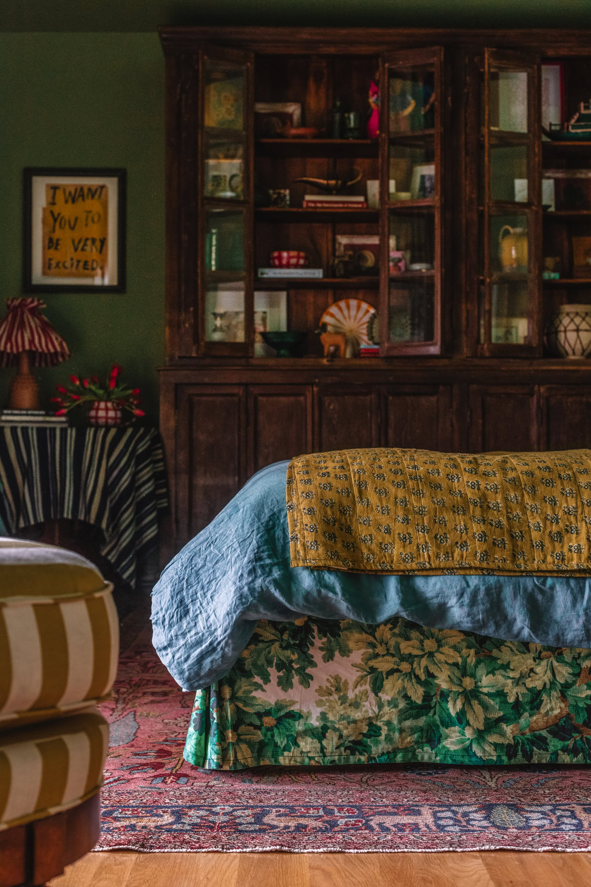
Mixing patterns with furniture and textiles
I knew I wanted to add a lot of prints to this room, from florals to stripes of all kinds.

We chose this green forest print for the bed thanks to our partnership with The Inside. Underneath, I added an antique Persian rug and pulled lots of other colors from there for the rest of the room.

I dyed our white quilt blue and added a block print quilt on top, plus a striped pillow I made from African fabric I found at the flea market.

The chair was actually a roadside find that our upholsterer had reupholstered in a citrine cottage stripe from The Inside. What I loved about this is that we could match it with other elements in the room, like the curtains and pillows, because the same fabric was available in many products.

Showing our art collection

I’ll add a gallery wall anywhere I get the chance and creating a new one in our bedroom was no exception. It’s also a great way to disguise a Frame TV.

This art has been collected over the last 8+ years from flea markets and independent artists. I’ll link what I can! I even painted the striped plate piece myself and cross stitched the Wizard of Oz piece. The fan is something we bought in Mexico City. I wrapped an old piece of art in fabric and pinned the fan to it before framing it!

You may recognize the teal portrait in our Palm Springs kitchen and the ballet dancers (my favorite piece of art I’ve ever purchased!) in the dining room. I hope to continue this gallery above our sliding doors eventually as we collect art over time.
To balance the busyness of the gallery wall, I put a small piece of art, painted by my friend Michael, above our bed. I love the contrast!

Lastly, we added what I will call my “Disney” corner, with an old map of Disneyland that we have had for years, a piece that reminds me of Mary Poppins, and a 3-piece collection of carriages in the cutest colors. I always add a little bit of Disney to every room I make as it means a lot to our family.

Can you spot any other Disney touches?

Vintage hutch as storage in a bedroom
I really wanted to add more storage to this room. We don’t have many walls in this 1930s house that don’t have windows, doors, or arches, so after closing the door on this wall (which we didn’t need), I wanted to maximize storage and display space!

I found this vintage rabbit hutch from Olive Ateliers (you can find similar ones here) and loved that it had closed storage on the bottom, for storing clothes, and open storage on top to display more treasures we’ve collected.

It has worked perfectly for us!
Secondhand Nightstand Makeover
Nightstands are, in my opinion, the hardest items to find.

Finding ones that are good quality, the right size/style and a matching pair at the right price is almost impossible! Many of the new ones are of poor quality and many of the old/vintage ones are quite expensive.

I ended up finding these nightstands, probably from the ’90s (?), on Facebook Marketplace and I liked that they were solid wood. I knew I could paint them and change the hardware to update them. I chose Eating Room Red by Farrow & Ball because I wanted to highlight some of the red tones in both the rug and the frames/artwork I chose and contrast that Yeabridge Green on the walls. Then I added simple gold hardware to finish them off.
I’m so happy with how they turned out!
Unique lighting to finish a space
I love adding unique lighting fixtures to finish a space and mixing styles to add dimension.

I brought my favorite crystal sconces from our Palm Springs dining room to place next to our bed.

Next, I added some color with our other accessories: a blue sconce from Sazerac Stitches (I made it an add-on at our local lighting store!), a warehouse sale find from a vintage yellow chandelier, and a DIY striped lampshade added to a terra cotta lamp.

I find some of my favorite deals on vintage and second-hand lamps. It is very easy to rewire, convert and upgrade them and they will be like new again!

Get the look
Many of the pieces in this space are vintage or vintage. I put together a collection of paint colors including Yeabridge Green, furniture, and similar art and decor pieces that I have in this space to make it easy to see everything in one space. You can see it (and buy it) right here!

I love how many layers this room has now. It’s so cozy and comfortable and I’m also excited to continue deepening its layers as time goes on!
Photos by Jeff Mindell
Design by Kelly Mindell
This post may contain affiliate links. All opinions are my own. The Inside and Farrow and Ball provided products for this post.

")

