
Last week I was going through boxes and boxes of random stuff in the sunroom to make room for the items I needed to move out of our home gym so I could begin the gym-to-bedroom conversion. And while I was going through those boxes, I came across a lot of old decorating magazines.
I love flipping through old magazines to revisit old trends. I still get inspired by things I see in those old magazines. But one of them really caught my eye. Since we’re going to be adding to our kitchen in the near future, this special edition of Kitchen & Bath magazine was especially interesting to me. I was really curious to see if any of these kitchens would still look “current” today.
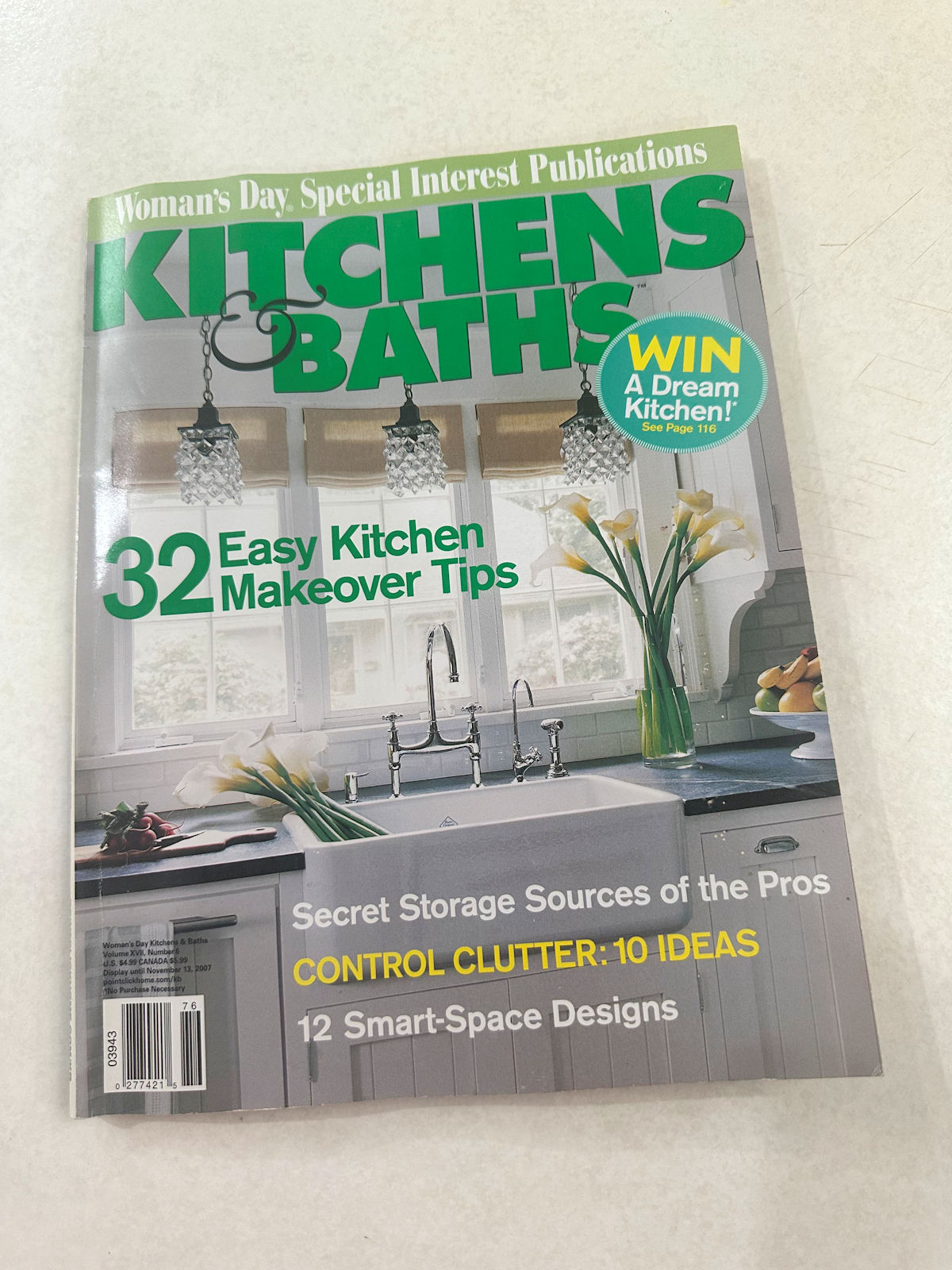
This magazine is from 2007, so it is seventeen years old.


Probably the most interesting thing is that it costs $4.99.


I bought a similar magazine last week. It has about the same number of pages and the same number of articles.


But this one cost $14.99. How depressing.


But anyway, back to the 2007 issue. What really struck me was all the dark cabinets. Almost every ad in the magazine featured dark stained wood cabinets. And I was never a fan of those little square tile backsplashes, even in 2007.


But advertisements showing dark stained wood cabinets were numerous.


In fact, in the entire magazine, I don’t think I saw one ad that featured anything other than dark-stained wood cabinets. And travertine. Oh my God, so much travertine!


This was during the time I had my interior decorating business and I remember those trends. Everyone wanted dark stained cabinets with travertine backsplashes and they wanted their homes decorated to look like they were straight out of a Pottery Barn catalog.


All I wanted to do was decorate with color, and yet I was stuck in this endless hell of dark wood, travertine, Pottery Barn with a hint of “Texas Tuscany.” I couldn’t escape it.


I mean, these ads with the dark wood cabinets seemed endless! Every single ad!


And even when they tried something different, like this more contemporary look, it was still dark.


Then I got to the features. This is the kitchen on the cover.


At least it’s white and bright. It’s definitely the closest thing to “timeless” in the entire magazine.

Here’s another before and after photo. Tell me what you think. Is it timeless? I don’t think so. The after photo looks like a before photo today.


I was also surprised to see how many black and white kitchens there were in this post. The one on the cover has white cabinets and a black countertop. The one above is the same. And here’s another one below.


I remember that style very well. Although the cupboards are light-coloured, the room has a certain heaviness.


Even this kitchen, which is much whiter and brighter, has a heavy feel to it. I think kitchens in the past were a bit exaggerated. Today everything seems lighter, brighter and simpler.


This was probably the closest design I could come to passing as timeless, although I think a fresh coat of white paint would really do this kitchen some good.


For me, this is an absolute no.


I think this probably looked contemporary in 2007, but not today.


And I don’t even remember this being popular in 2007.


This one might still be fine today with a few updates, like the roof. And I’d also remove those heavy corbels. I remember they were very popular back then, but I don’t see them in use anymore.


So let me know what you think. Do any of these designs strike you as “timeless designs”? Personally, I don’t think there is such a thing.

Addicted 2 Decorating is a space where I share my DIY and decorating experience while remodeling and decorating the 1948 home my husband Matt and I purchased in 2013. Matt has multiple sclerosis and is unable to do physical labor, so I do most of the work around the house alone. You can learn more about me here.


